

Analytics has become a focus for me over recent months. I’ve been doing a lot of work with Google Analytics, event tracking with Google Tag Manager, and building reports in the newly released Google Data Studio.
I’ll explore that a lot further in future posts, but today I thought I’d shake out some old tinkerings I’ve had stuffed away somewhere gathering digital dust.
The return of the social graph
Back in my early days working with community platforms, I recall hearing the term “social graph”, referring to the representation of a model of the participants in a network and the relationships, connections or interactions between them. It is accredited to Facebook’s CEO Mark Zuckerberg from back in 2007, and over the following years it became an important concept for businesses to understand and leverage.
Over recent years in the community space we’ve seen a focus on metrics showing more direct top and bottom line impacts and ROI of our communities. The deeper, more complex - and let’s be honest, given its statistical nature the academic feel of network analysis - seems to have been somewhat forgotten.
The recent news from Jive of their upcoming “PeopleGraph” promising to “re-establish people as the center of enterprise social networks” both caught my attention and took me back a decade! It will be interesting to see where this will take us, as arguably none of the platform vendors have yet delivered on the potential of the social graph in the enterprise context. I’m looking forward to hearing what Amazon’s Neptune graph technology can help enable here.
Back to analytics, the news also had me recall some simple Social Network Analysis (SNA) exploration I’d started but not shared or taken anywhere. My curiosity got the better of me, and buoyed by the thought that it might be worth revisiting, a cold wet Sunday afternoon provided the excuse to dig it out.
Graphing some social
I wanted to refresh my rusty memory, so started with something simple. I’ll share the steps I took in creating a visualisation of the team at Social Edge and who we follow. I’m using our internal Jive instance as the network, and have obscured or renamed people for privacy.
Terms and concepts
Before we get stuck in, let’s take a look at three SNA concepts and terms that we’ll touch upon:
- Nodes - in our case, the people forming the network
- Edges - sometimes called ties, these are the relationships or connections between the nodes in the network
- Centrality - a measure or indication of the importance or influence of a node within the network
The wikipedia article provides a good overview and plenty more definitions.
Grab some tools
In order to create the graph, we’ll be using the network analysis and visualisation software Gephi, which is well-known, open-source, and available to download for multiple operating systems.
Once installed, if you’re a Gephi newbie, you’ll likely find this great tutorial as helpful as I did in order to get started.
I’d also recommend installing Postman, a great tool that will help us inspect and return Jive data via the REST API.
Now on to the Jive-specific aspects….
Step #1: People = Nodes
Our first step is to generate a list of nodes, which in our case we’re looking at list of registered users of our Jive community.
Unfortunately this isn’t as straightforward to get out of Jive as it could be. In my case I had the luxury of a previous report I’d pulled via the Jive API, which also gives me additional attributes from the user profile. These aren’t essential though, so one of the easiest approaches to get us started is a good old copy and paste from the People tab of the admin console.
I’d recommend deselecting include Deactivated Users and select just Standard-Access users.
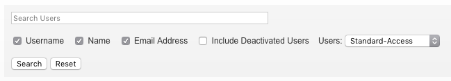
I’d then show 100 users per page in order to minimise any repeat copy & pasting.
We need to copy the list of users, and paste into your spreadsheet tool of choice. We can then tidy things up. We’re going to keep the UserID and Name columns, delete the rest, and then perform the following steps:
- Re-order the columns to put the UserID first.
- Rename the UserID column to Id
- Rename the Name column to Label
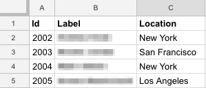
I mentioned I had additional profile fields in my report, so in this example I’m keeping the Location column, which I may decide to use later.
Save this file, we’ll be using it to import our “nodes”.
Step #1: Followers = Edges
Warning! This stage was easily the most time-consuming… you may want to grab a beverage of choice before proceeding!
Unfortunately there is no simple way to export a list of users and their followers, so we’re going to have to dive into the Jive REST API in order to pull out the followers for each user.
If you’re not yet familiar with how the Jive API presents a user profile, start with inspecting your own in a browser. Login to Jive first, then use the following link (replacing <jive instance> with the hostname of your Jive instance):
https://<jive instance>/api/core/v3/people/@me
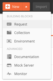
We can also do the same in Postman, to get started, click New > GET Request
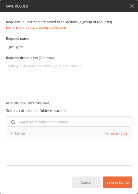
Give it a name and save to a collection.
Now enter the same URL into the URL field, and select Basic Auth from the Type list on the Authorization tab below it, and enter your Jive username and password.

We’re all set, and you can hit the big blue Send button.
Give it a second and you’ll see returned the same text representation of your user profile as you did in the browser.
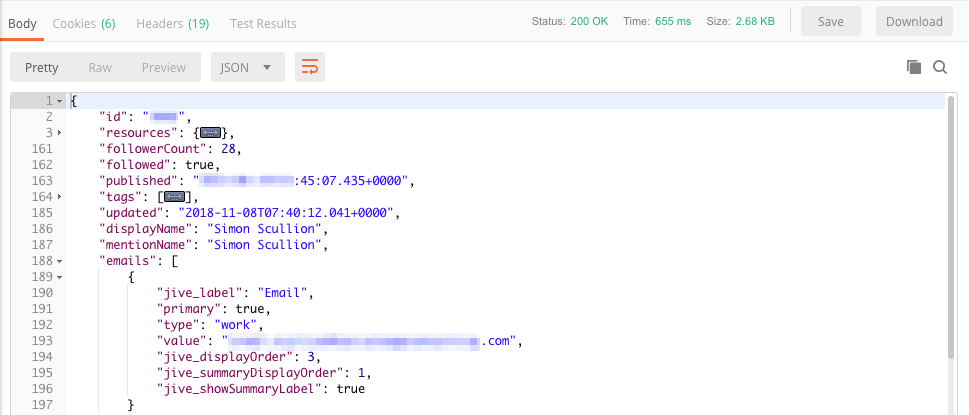
You’ll notice I have collapsed the resources and tags sections here for readability.
It is actually buried in this resources section that we can find the reference to both followers and following:
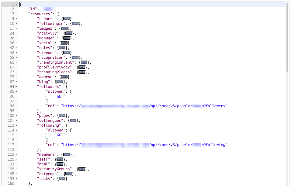
However these are just links I hear you cry!
Unfortunately Jive doesn’t provide us with even the UserID’s of our followers directly within the user profile data.
So we have to go and get it, using another request to the API.
This time we’re going to need the UserID of the person we want to return the list of followers for, and our GET request URL is (replacing <Jive Instance> and <UserID> appropriately):
https://<Jive Instance>/api/core/v3/people/<UserID>/@followers?fields=-resources,id
I’ve added ?fields=-resources,id here to limit the data returned to just provide us the minimum, we’re only after the UserID’s of the followers.
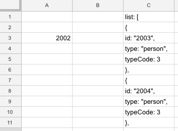
What we get back will look like this:
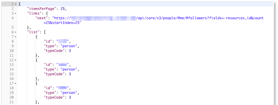
Note the links section at the top. If the user is following more than 25 users, the results are pages, and we can click through the pages using the next link.
So what I did was simply copy these results, and drop them into column C of a new spreadsheet.
You’ll want to note the UserID in column A for each user, doing so in the row against the UserID of the first follower will make things easier in a moment.
I repeated this copy & paste exercise for each of the UserID’s in my nodes file, and for each page of results for users with more than 25 followers.
Next, I used the following formula in Column B to extract the clean UserID’s of the followers from the mess in Column C! A row without a UserID will remain blank:
=if(LEFT(C1,3) = "id:",REGEXEXTRACT(C1,"[0-9][0-9][0-9][0-9]"),"")
Note: I’m using Google Sheets, the formula may vary slightly in Excel.
We then need to fill the gaps in Column A. Here I’ve also added the column headings Source and Target we’ll require.
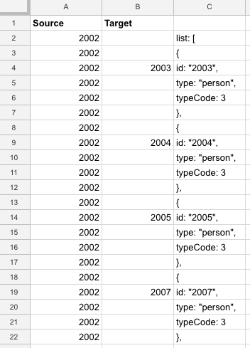
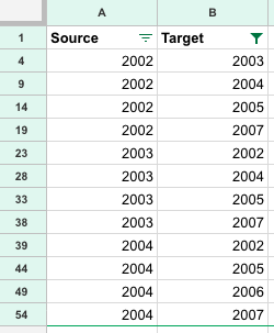
We can then simply use a filter to remove the empty rows, I then copied Columns A and B to a clean sheet which we’ll save as our “edges”.
Still with me?
Good effort!
Since I was working with a fairly small set of users to begin with, I felt I could live with it this time round.
It could be done programmatically however - insert future post here! ;)
Step #3: Getting started in Gephi
If we’ve recovered enough from that effort, and now armed with our files of “nodes” and “edges”, we can fire up Gephi.
We’re going to start in the Data Laboratory tab, and as per the tutorial, we’re going to import our files of nodes and edges.
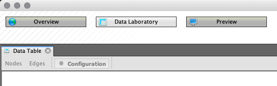
In the menu File > Import Spreadsheet and select your nodes file.
In the dialog, check the correct worksheet is selected, review the columns and Nodes table is selected in the Import as dropdown. Select Next.
The second step allows you to review the columns being imported, and change data types if required.
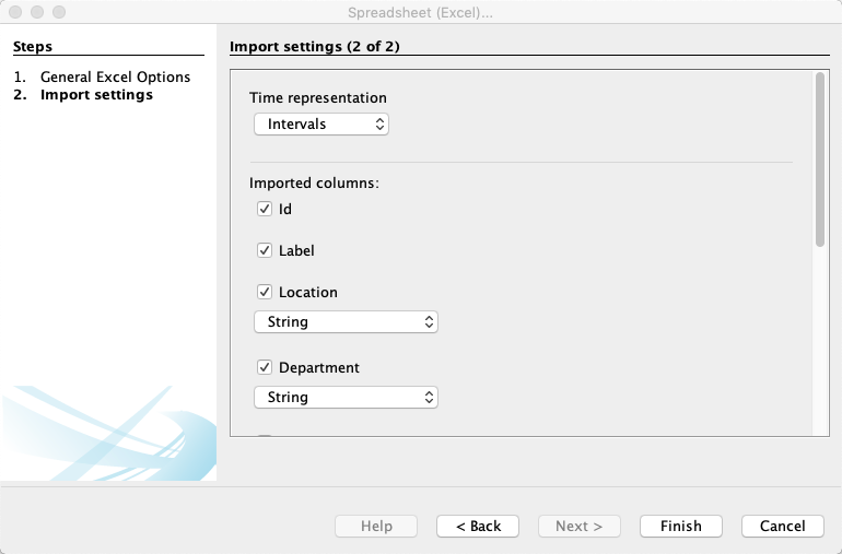
Here I have a file containing Departments and Locations as additional columns for my nodes. If all is well, we can Finish. We’ll get an import report dialog that will show any errors encountered.
We’ll repeat the import process, selecting the edges file, with Edges table in the Import as dropdown.
Important: On the Import report dialog, select Append to existing workspace to keep the nodes and edges in the same workspace
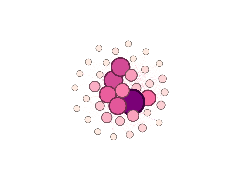
If all has gone well, we can now switch to the Overview tab, and meet our graph…
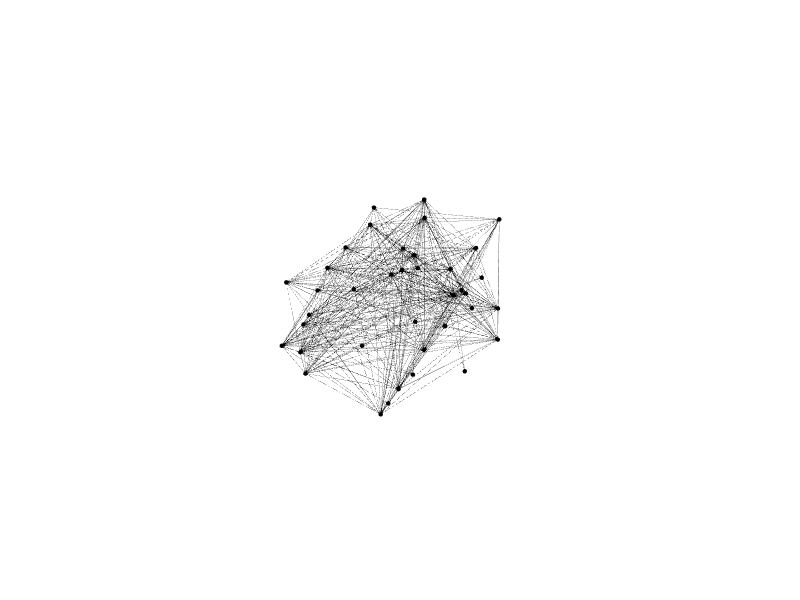
Underwhelming at all!? Let’s smarten things up…
The initial layout is random, so we can apply an algorithm to improve things. In the layouts pane, select Fruchterman Reingold and have a play with the parameters. Select Run and watch the graph stabilise. Then click Stop.
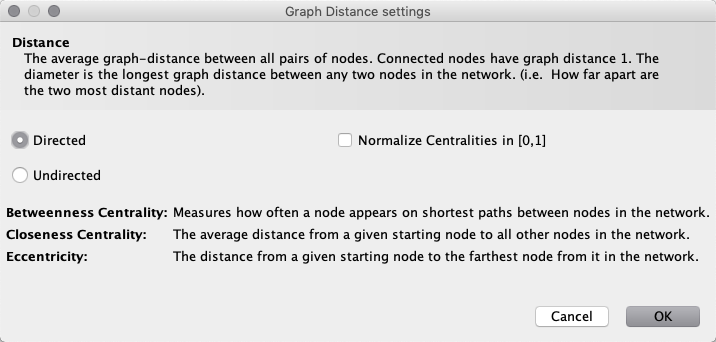
Now in the Statistics pane, we’re going to run the Network Diameter calculation.

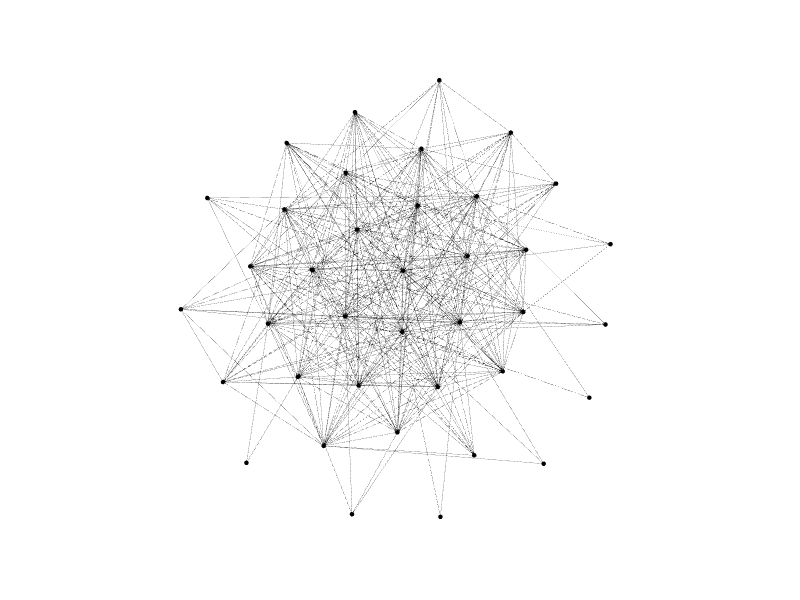
We can then use this to color and size our nodes.
In the Appearance pane, click Nodes, then the palette

icon, and the Ranking tab dropdown, select Betweenness Centrality. We can then choose a colour range, and adjust to taste. Click Apply at the bottom of the pane.
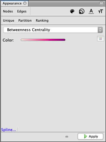
We can repeat these steps, but selecting the Size

icon, and adjusting the range.
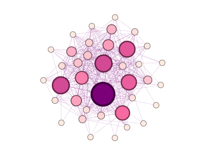
Our graph is now looking something like this:
Betweenness Centrality is a measure of the number of times a node lies on the shortest path between other nodes. In other words, we’ve made larger and darker nodes for users who are being followed by more of their peers.
We can further adjust the layout, the Noverlap and Expansion options are useful.
Switching to the Preview tab, we can further adjust the presentation of our graph, including show the node labels - our users’ names. I’ve also mentioned including other user attributes in the node file, we can use these as alternatives to style the graph, for example colouring by department or location.
The finished graph
Gephi allows us to save our work as a project file, and also export the graphs in various formats, making it easy to share a visualisation of our network.
In the end, the hardest work was in processing the data in order to create the graph!
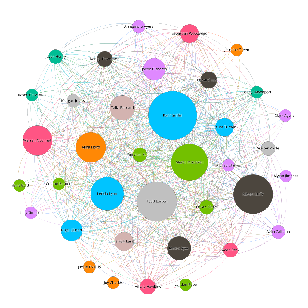
A social network graph showing Jive users and their followers, coloured by department and identifying those being followed by more of their peers as larger in the graph.
Appetite for more?
I’m currently sitting on a nice analytics dataset from Jive’s Data Export Service (DES). Since this contains actual actions such as likes, comments, follows, I’ll be looking to explore further what visualisations I can create from that.
If you’re compelled to give this a go yourself, I’d love to see what you come up with, and what the results look like!
What other network analyses would you find interesting? Let me know what you think!


